Client
Project Type
Digital clarity. Visual power.
The Introduction
As a digital testing powerhouse working with some of the UK’s leading e-commerce brands, Digivante needed a visual identity that reflected their expertise, agility, and growth. We were brought in to evolve the brand — not just visually, but strategically — by sharpening their logo, developing a flexible design system, and creating standout branded collateral. The refresh had to balance credibility with energy, helping Digivante better connect with clients, partners, and internal teams alike.
The Problem
Though Digivante had a strong service offering, their existing brand identity felt outdated and inconsistent. The logo was functional but lacked polish and adaptability. Marketing materials varied in style, and there was no unified system to guide internal teams or external-facing content.
Key challenges included:
- An overly complex logo that struggled at small sizes and on digital interfaces.
- A lack of brand consistency across whitepapers, decks, and web materials.
- No recognisable pattern or design language to unify the brand across formats.
- A colour palette that didn’t reflect the boldness or modernity of the business.
The result? A brand that didn’t match the quality or innovation of the service it represented.
The Solution
We focused on building a future-proof identity — one that was sharp, scalable, and unmistakably Digivante.
Our approach included:
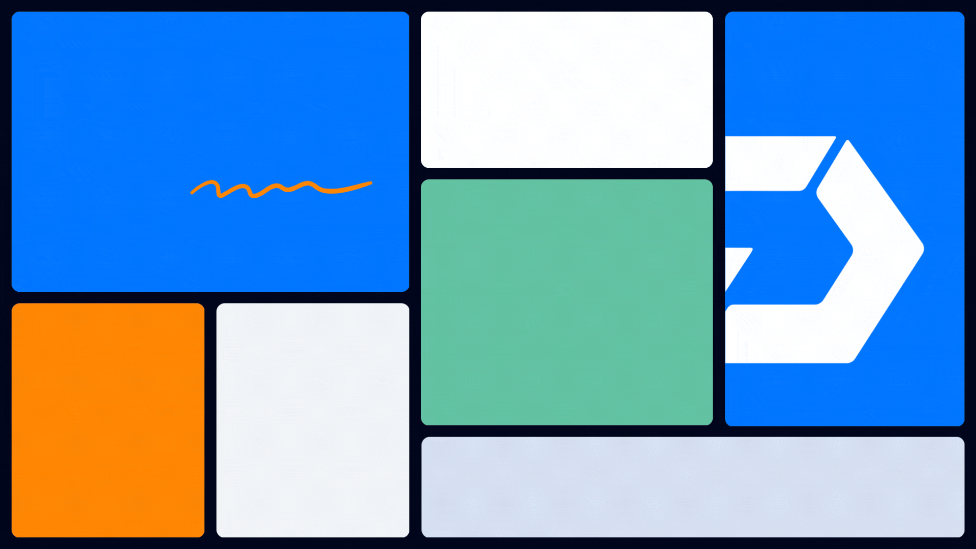
Logo Refinement: We simplified and modernised the “D” mark, improving symmetry and usability while retaining the brand’s recognisable core.
Brand System: By dissecting the logo into bold geometric elements, we created a flexible pattern system that could be used across digital and print collateral — from hero backgrounds to subtle texture overlays.
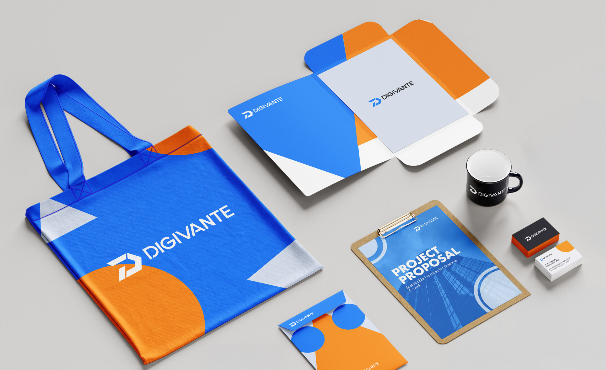
Whitepaper & Template Design: We developed clean, confident templates with clear hierarchies, plenty of white space, and signature brand touches — setting the tone for all future content.
Color Strategy: A refined palette was introduced — led by a vibrant tech blue and grounded by confident, accessible darks — striking the balance between trust, innovation, and clarity.
The result was a sleek, cohesive brand system that didn’t just look better — it worked better, making it easier for teams to produce high-impact content with consistency and pride.